
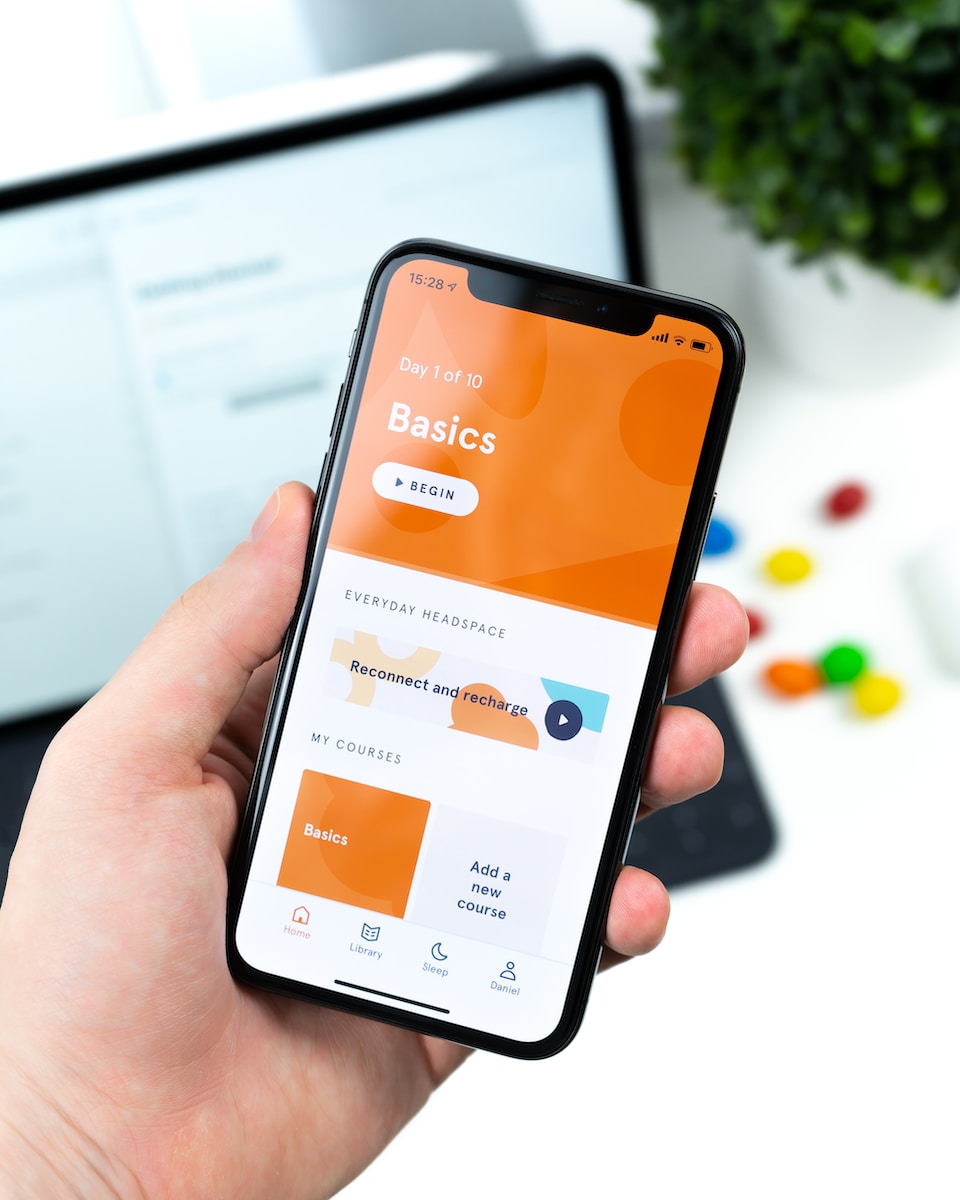
As e-commerce continues to shift towards mobile devices, businesses must ensure their websites are optimized for mobile use. With more and more consumers using their smartphones and tablets for online shopping, neglecting mobile optimization can have a significant impact on sales and overall success.
In this guide, we will provide step-by-step guidance on how to optimize your WooCommerce website for mobile devices. We’ll explore the importance of mobile optimization, key factors to consider, best practices, and strategies for creating a tailored mobile optimization plan.
Key Takeaways:
- Mobile optimization is essential for ensuring successful e-commerce sales in today’s market.
- Responsive design, fast loading speeds, and user-friendly navigation are all key factors in mobile optimization for WooCommerce.
- Implementing best practices, such as optimizing product images and simplifying the checkout process, can significantly improve mobile user experience.
Why Mobile Optimization is Essential for WooCommerce Websites
As we continue to see an increase in mobile usage for online shopping, it is more important than ever to have a mobile-friendly website. This is especially true for WooCommerce users who rely on e-commerce sales to grow their business. A well-designed mobile interface can enhance user experience, increase engagement, and ultimately lead to higher sales conversion rates.
Neglecting mobile optimization for your WooCommerce site can have significant consequences. Frustrated users who struggle to navigate a non-responsive mobile site are likely to abandon their shopping cart and seek out a competitor with a more user-friendly interface. In fact, studies show that nearly 80% of consumers will leave a mobile site if it does not meet their expectations.
By prioritizing mobile optimization for your WooCommerce site, you can stay ahead of the competition and keep your business thriving in the ever-growing e-commerce industry. So, let’s dive into the key factors you should consider when optimizing your site for mobile devices.
Key Factors to Consider in Mobile Optimization for WooCommerce
When it comes to optimizing your WooCommerce website for mobile devices, there are several key factors to consider. These factors ensure that your site is not only mobile-friendly but also optimized for mobile users to provide a seamless browsing experience. In this section, we’ll discuss the top mobile optimization tips for WooCommerce to help you improve your website’s performance on mobile devices.
Responsive Design
One of the most important factors to consider for mobile optimization is responsive design. A responsive design ensures that your website is displayed correctly on different devices, including smartphones and tablets, by adapting to the screen size. A mobile-friendly site not only improves user experience but also helps with your search engine rankings. Google now considers mobile-friendliness as a ranking factor, so having a responsive design is crucial for your SEO efforts.
When designing for mobile, you should ensure that your website’s fonts are legible and large enough to read on smaller screens. You should also consider the placement of buttons and navigation menus for easy accessibility on mobile devices.
Fast Loading Speeds
Mobile users often have limited bandwidth and slower internet speeds, which means that your website’s pages should load quickly to avoid frustrating users. Slow loading speeds can lead to increased bounce rates and decreased conversions. To optimize your website’s loading speeds, compress your images, use a content delivery network (CDN), and minify your website’s codes. There are also caching plugins available for WooCommerce that can help speed up your website’s load times.
User-Friendly Navigation
A user-friendly navigation enhances the user experience by making it easier for users to find what they’re looking for quickly. For mobile websites, it’s recommended to use a simple, easy-to-use navigation menu. A hamburger menu, which is a three-line icon that opens up the menu when clicked, is a popular choice for mobile devices.
You can also consider using breadcrumb navigation, which allows users to see where they are on the website and to navigate back to the previous page easily. Additionally, optimizing your website’s search functionality can help improve user experience on mobile devices.
Optimized Content
Optimizing your website’s content for mobile devices is crucial for improving user experience. Your content should be concise and optimized for smaller screens. Avoid using large blocks of text and use bullet points or lists instead. You should also ensure that your website’s images are optimized for mobile devices to help with loading speeds.
By considering these key factors for mobile optimization, you can improve your WooCommerce website’s performance on mobile devices and provide a seamless user experience for your visitors.
Best Practices for Mobile Optimization in WooCommerce
When it comes to mobile optimization for WooCommerce, responsive design is key. Your website needs to look great and function well, whether it’s being viewed on a mobile phone or a tablet. Here are some mobile optimization best practices for WooCommerce to keep in mind:
Implement Responsive Design
Responsive design is a must for mobile optimization. Your website should adapt to the size and orientation of the screen it’s being viewed on. This ensures that your content is always legible and easy to navigate, regardless of the device being used.
One way to implement responsive design is to use a mobile-friendly theme. There are many themes available that are specifically designed for mobile devices. Alternatively, you can hire a developer to create a custom mobile theme for your WooCommerce site.
Optimize Product Images
Large images can slow down your website’s load time, which can negatively impact the user experience. To optimize product images for mobile devices, consider using a plugin that will compress your images without sacrificing quality.
You can also optimize your images by using the correct file format. JPEG is usually the best choice for photographs, while PNG is ideal for images with transparent backgrounds.
Simplify Checkout Processes
A complicated checkout process can discourage customers from completing their purchases. To simplify the checkout process for mobile users, consider using a one-page checkout plugin. This will streamline the process and make it easier for customers to complete their orders.
You can also enable guest checkout and allow customers to check out without creating an account. This can save time and simplify the process for customers who are in a hurry.
Improve Page Load Times
Page load times are especially important for mobile users, who may be using slower internet connections. To improve page load times, consider using a caching plugin. This will store your website’s content and serve it to users quickly, without having to retrieve it from the server each time.
You can also optimize your website’s code by minifying CSS and Javascript files. This will reduce file sizes and make your website load faster.
By following these mobile optimization best practices for WooCommerce, you can ensure that your website is user-friendly and accessible on any device.
Creating a Mobile Optimization Strategy for WooCommerce
When it comes to optimizing your WooCommerce website for mobile devices, there’s no one-size-fits-all solution. To create a mobile optimization strategy that works for your business, it’s important to analyze user behavior and identify pain points.
Start by looking at your website analytics to see how users are accessing your site. Are they primarily using mobile devices? What pages are they visiting? How long are they staying on your site? This data can help you identify where to focus your optimization efforts.
Next, conduct user testing to gain insights into the user experience on your mobile site. Ask test users to perform specific actions, such as searching for a product or completing a purchase, and observe their behavior. This can help you identify areas of your site that may be causing frustration or confusion for users.
Based on your research, create a plan for optimizing your mobile site. This may include revising your site’s navigation, simplifying your checkout process, or optimizing product pages for mobile viewing. Set specific goals for your mobile optimization strategy, such as increasing mobile conversion rates or decreasing bounce rates.
Remember to regularly monitor and analyze your mobile performance after implementing your optimization strategy. This will enable you to make data-driven decisions and continue to improve the mobile experience for your customers.
Streamlining Navigation for Mobile Users in WooCommerce
When it comes to mobile optimization for WooCommerce, ensuring seamless navigation is crucial. Mobile users are often on-the-go and have less time to browse, so it’s important to make it as easy as possible for them to find what they’re looking for.
One effective strategy is to simplify menus and reduce the number of clicks it takes to get to a specific page. You can also optimize search functionality by offering auto-complete suggestions and filtering options.
| Tip | Consider implementing a drop-down menu for mobile users to save space and allow for easier navigation. |
|---|---|
| Use clear and concise language when labeling navigation links to avoid confusion for users. |
Another important aspect of navigation is optimizing product categorization. This means making it easy for users to find products by organizing them into relevant categories and subcategories.
Keep in mind that mobile users may be browsing with one hand, so it’s important to make navigation options accessible and easy to tap.
Consider using icons or images to enhance navigation and make it more visually appealing. However, be careful not to overload the page with too much imagery, as this can slow down load times and negatively impact user experience.
Overall, by streamlining navigation for mobile users in WooCommerce, you can enhance user experience and increase the likelihood of sales conversions.
Optimizing Product Pages for Mobile in WooCommerce
Product pages play a vital role in converting website visitors into customers for your WooCommerce store. However, it’s crucial to optimize them for optimal mobile performance. Here are some tips to help you achieve that.
1. Optimize Product Images
Ensure that the product images are optimized for mobile viewing. Large, high-resolution images can take a long time to load on mobile devices, causing frustration for the user. Compress and resize images to keep their file size to a minimum without sacrificing image quality.
2. Incorporate Clear and Concise Product Descriptions
Use short, descriptive and eye-catching product descriptions that are easy to read on mobile devices. Avoid using complex words or jargon that might confuse or bore users. Highlight the key benefits and unique selling points of the product.
3. Optimize Product Variations
If your product has variations, such as size or color, ensure that they are easy to find and select on mobile devices. Use dropdown menus or checkboxes for easy selection. Ensure that the selected variation is highlighted and clearly visible to the user.
4. Improve Overall Visibility and Sales Conversion Rates
Make sure that your call-to-action (CTA) buttons are large, clear, and easy to find on mobile devices. Use contrasting colors to make them stand out. Place them prominently on the page, ideally at the top and bottom. Use urgency language to nudge users towards making a purchase, such as “limited time offer” or “only a few left in stock”.
5. Ensure Mobile Compatibility
Test your product pages on a variety of mobile devices to ensure that they are compatible and display correctly. Use a responsive design that adjusts to the screen size of the device. Ensure that the page layout is intuitive and easy to navigate.
By following these tips, you can optimize your WooCommerce product pages for mobile devices and enhance your sales conversion rates. A user-friendly, mobile-optimized website can help you attract and retain more customers, boost your online sales, and scale your e-commerce business.
Tracking and Analyzing Mobile Performance in WooCommerce
Tracking and analyzing mobile performance is critical for optimizing your WooCommerce site. It enables you to gain insights into how users interact with your site on mobile devices and identify areas for improvement. Let’s explore some essential strategies for effectively monitoring mobile performance in WooCommerce.
Monitor Mobile Traffic
One of the first steps in tracking mobile performance is monitoring your mobile traffic. Google Analytics is a powerful tool that enables you to track mobile user behavior, including bounce rates, session duration, and pages per session. You can also use Google Analytics to track your mobile traffic sources, including social media, email campaigns, and paid ads. By monitoring your mobile traffic, you can gain insights into user behavior and make data-driven optimizations.
Measure User Engagement
Engagement metrics provide insight into how users interact with your site on mobile devices. These metrics include click-through rates, time on page, and scroll depth. Tools like Hotjar can track user behavior on your site by creating heatmaps to show where users click and scroll most frequently. By analyzing engagement metrics, you can identify areas for improvement and optimize your site for mobile users.
Optimize Conversion Rates
Conversion rates are critical for measuring the success of your WooCommerce site on mobile devices. You can use tools like Google Analytics to track your mobile conversion rates, including the number of purchases and sign-ups. By optimizing your conversion rates, you can improve your mobile site’s overall performance and increase sales revenue.
Tracking and analyzing mobile performance in WooCommerce is essential for optimizing your site for mobile users. By monitoring mobile traffic, measuring user engagement, and optimizing conversion rates, you can enhance your site’s overall performance and boost your online sales.
Conclusion
Mobile optimization is crucial for any e-commerce website, especially for businesses using WooCommerce. In this guide, we’ve explored the importance of mobile optimization, discussed key factors to consider, and provided practical tips and best practices to implement.
It’s essential to remember that a mobile-friendly website enhances user experience, which, in turn, impacts sales conversion rates. Neglecting mobile optimization on your WooCommerce site can result in missed opportunities and the loss of potential customers.
Take Action
Implementing the strategies and tips we’ve covered in this guide can help boost your online sales through effective mobile optimization. Remember to analyze user behavior, simplify navigation, optimize product pages, and track mobile performance to gain insights and make data-driven optimizations.
Don’t hesitate; take action today to enhance your WooCommerce site’s mobile optimization and give your business the competitive edge it needs to succeed. Let’s get started!
FAQ
Q: What is mobile optimization for WooCommerce?
A: Mobile optimization for WooCommerce refers to the process of optimizing a WooCommerce website to ensure it is fully functional, visually appealing, and user-friendly on mobile devices. This involves making design adjustments, optimizing page load times, and improving navigation to enhance the mobile user experience.
Q: Why is mobile optimization important for WooCommerce websites?
A: Mobile optimization is crucial for WooCommerce websites because a large percentage of online shoppers use mobile devices to browse and make purchases. If your website is not mobile-friendly, you may lose potential customers and sales. By optimizing for mobile, you can improve user experience, increase conversions, and boost online sales.
Q: What are some key factors to consider in mobile optimization for WooCommerce?
A: When optimizing a WooCommerce website for mobile devices, it is important to consider responsive design, fast loading speeds, and user-friendly navigation. Responsive design ensures your website adapts to different screen sizes, fast loading speeds provide a seamless user experience, and user-friendly navigation makes it easy for mobile users to find what they are looking for.
Q: What are some best practices for mobile optimization in WooCommerce?
A: Some best practices for mobile optimization in WooCommerce include ensuring responsive design, optimizing product images for mobile viewing, simplifying the checkout process, and improving page load times. Additionally, it is important to prioritize mobile-friendly features and functionality to enhance the overall user experience on mobile devices.
Q: How can I create a mobile optimization strategy for my WooCommerce website?
A: To create a mobile optimization strategy for your WooCommerce website, start by analyzing user behavior, identifying pain points, and implementing targeted improvements. Consider factors such as page load times, navigation ease, and checkout process efficiency. By addressing these areas, you can develop an effective strategy to optimize your website for mobile users.
Q: How can I streamline navigation for mobile users in WooCommerce?
A: To streamline navigation for mobile users in WooCommerce, focus on simplifying menus, improving search functionality, and optimizing product categorization. Ensure that menus are easy to navigate and search functionality is effective. Organize products into clear categories and subcategories to make it easier for mobile users to find the products they are looking for.
Q: How can I optimize product pages for mobile in WooCommerce?
A: To optimize product pages for mobile in WooCommerce, consider strategies such as displaying product images in a mobile-friendly format, incorporating clear and concise product descriptions, and optimizing product variations for easy selection. It is also important to ensure that the overall layout and design of the product pages are responsive and visually appealing on mobile devices.
Q: Why is tracking and analyzing mobile performance important in WooCommerce?
A: Tracking and analyzing mobile performance in WooCommerce is important because it allows you to understand how your website is performing on mobile devices. By monitoring mobile traffic, user engagement, and conversion rates, you can identify areas for improvement and make data-driven optimizations to enhance the mobile user experience and boost online sales.